Packaging of Arbouse Beer
Introduction
The Student Project aims to create the packaging for a fictional arbouse beer, exploring strategic positioning, flavor selection, brand definition, and graphic design, including the logo, label, etc.
Strategic Positioning
- The beer targets the booming market of craft beer.
- No brewery specializing in arbouse has been identified.
- The arbousier is symbolic, associated with resistance, fertility, loyalty, and peace.
Target and Persona
Target:
- Consumers of local craft beer.
- Enthusiasts of unique flavors.
- Interest in Corsican products.
- Support for local artisans. Persona:
- Age: 20-100 years
- Location: France
- Responsible consumption, appreciates beer diversity.
Container and Label Choice
- Bottle preferred for a local and organic craft beer.
- Basic rectangular label of 8 cm by 6 cm.
Graphics
Logo Creation
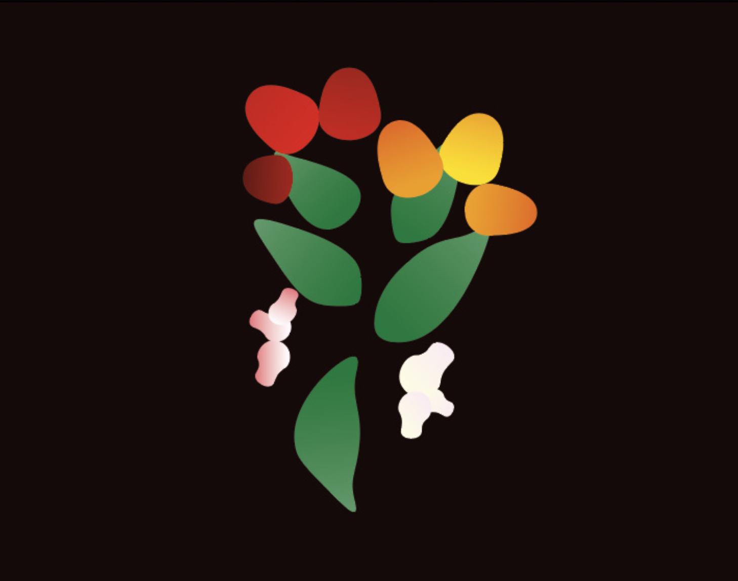
- Inspired by the arbousier, depicting the flower-to-fruit cycle.
- Used Adobe Illustrator for detailed design.
- Adopted a minimalist 2D style.
Typography Choice
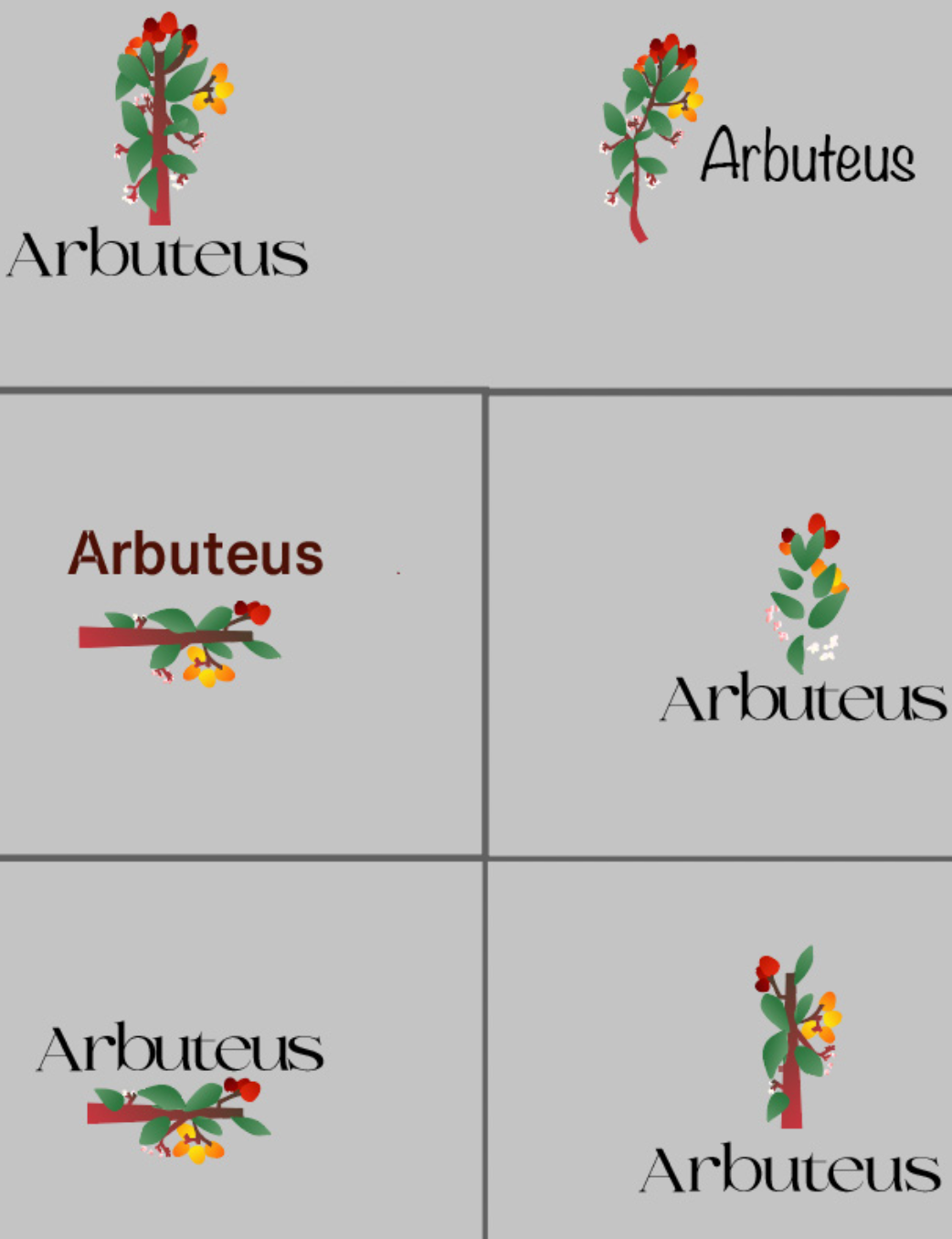
- “Selino” font for a premium image.
- Complemented by Helvetica Light for additional information.
Color Choices
- Incorporates arbousier colors with gradients to symbolize the cycle.
Graphic Style and Layout
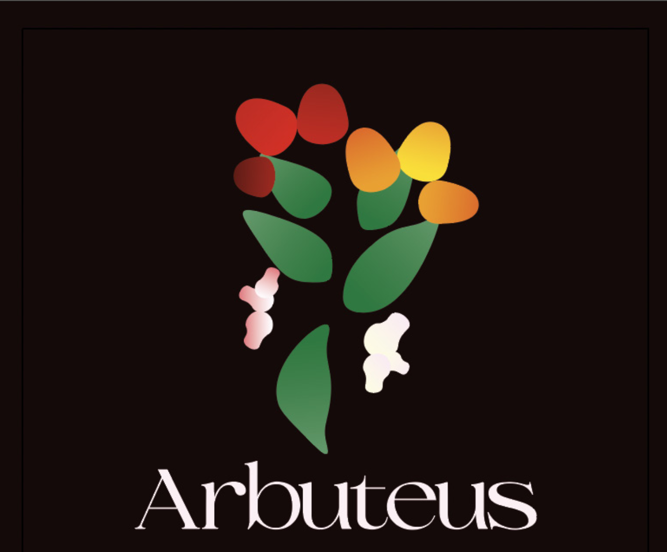
- Minimalist, clean, modern in 2D to represent a simple arbouse beer.
- Layout avoids a low-end effect, giving a premium appearance.
Web Advertisements
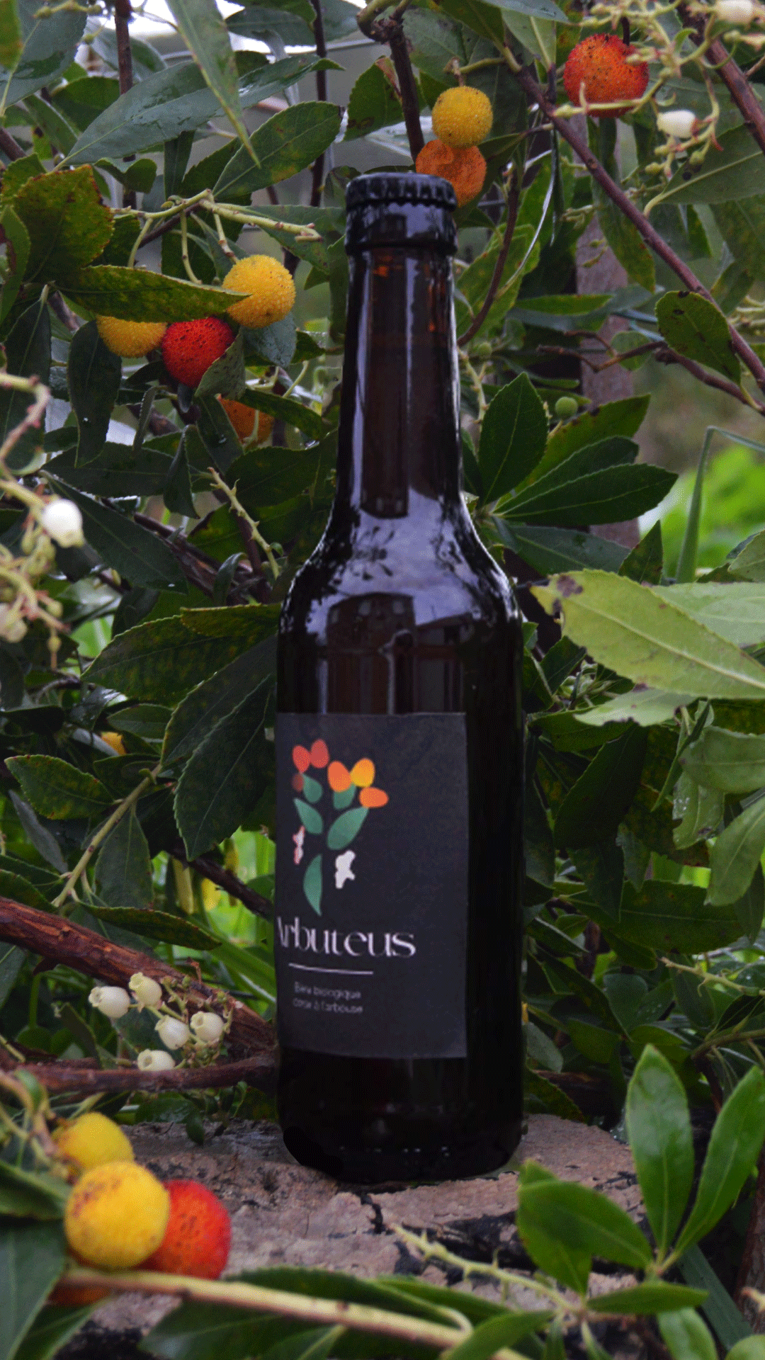
- Created visuals with the label integrated into a bottle, near an arbousier.
- Developed a GIF showing the rotating bottle.
Conclusion
The SAE covers strategic positioning, graphic design, and web advertising, emphasizing the creation of a distinctive product and the visual communication process.